Driving Fatalities in US

This week I will explore data traffic fatalities in several US cities, and analyze the differences in the data.
Exploring the data
The data was obtained from the National Highway Traffic Safety Administration (NHTSA). You can download the data from their website and it clean for this analysis using the following script.
library(data.table)
library(glue)
library(httr)
library(dplyr)
library(purrr)
library(ggplot2)
library(lubridate)
library(viridis)
library(broom)
library(forcats)
library(tidyr)
library(hrbrthemes)
library(stringdist)
library(ggsci)
library(ggpubr)
library(stringr)
library(latex2exp)
library(tibble)
library(tidymodels)
library(latex2exp)
library(CircStats)
library(cowplot)

base_url <- "https://www.nhtsa.gov/filebrowser/download/"
download_links <- c(280571, 176791, 118801, 122001, 122041)
n <- length(download_links)

download_data <- function(base_url, ext, year) {
  dir.create(glue("data/{year}"), recursive = TRUE)
  url <- glue("{base_url}{ext}")
  GET(url, write_disk(
    data_cleaning <- tempfile(fileext = ".zip", tmpdir = "data")))
  unzip(data_cleaning, exdir = glue("data/{year}"))
  unlink(data_cleaning)
}

#lapply(1:n, function(i) {
#  ext <- download_links[i]
#  year <- 2020 - i
#  download_data(base_url, ext, year)
#})

# Population numbers
detroit <- c(3648000, 3632000, 3616000, 3600000, 3571000)
nyc <- c(18648000, 18705000, 18762000, 18819000, 18805000)
chicago <- c(9552550, 9533660, 9514110, 9484160,    9458540)
boston <- c(670491, 679848, 687788, 691147, 692600)
san_francisco <- c(863010, 871512, 878040, 880696, 881549)
austin <- c(921114, 939447, 951553, 962469, 978908)
pop <- c(detroit, nyc, chicago, boston, austin)

population <- data.frame(pop = pop,
                         year = rep(2015:2019, 5),
                         city = rep(c("Detroit", "NYC", "Chicago", "Boston",
                                      "Austin"), each = 5))

read_file <- function(year, file) {
  files <- list.files(glue("data/{year}"))
  file_name <- files[agrep(file, files, ignore.case = TRUE)]

  glue("data/{year}/{file_name}") %>%
    fread()
}

merge_files <- function(years, file) {
  lapply(years, function(year) read_file(year, file)) %>%
    rbindlist(fill=TRUE, use.names=TRUE)
}

cities <- c(1260, 4170, 1670, 0120, 3290, 0330)
years <- 2015:2019
files <- c("accident", "person")

df <- sapply(files, function(file) merge_files(years, file))

accident <- df$accident %>%
  filter(CITY %in% cities) %>%
  mutate(CITY = case_when(CITY == 4170 ~ "NYC",
                          CITY == 1260 ~ "Detroit",
                          CITY == 1670 ~ "Chicago",
                          CITY == 0120 ~ "Boston",
                          CITY == 3290 ~ "SF",
                          CITY == 0330 ~ "Austin"
  ),
  date = ymd(glue("{YEAR}-{MONTH}-{DAY}")),
  HOUR = ifelse(HOUR > 23, NA, HOUR),
  MINUTE = ifelse(MINUTE > 59, NA, MINUTE),
  ARR_HOUR = ifelse(ARR_HOUR > 23, NA, ARR_HOUR),
  ARR_MIN = ifelse(ARR_MIN > 59, NA, ARR_MIN),
  NOT_HOUR = ifelse(NOT_HOUR > 23, NA, ARR_HOUR),
  NOT_MIN = ifelse(NOT_MIN > 59, NA, ARR_MIN),
  HOSP_HOUR = ifelse(NOT_HOUR > 23, NA, ARR_HOUR),
  HOSP_MIN = ifelse(NOT_MIN > 59, NA, ARR_MIN),
  time = as_datetime(ymd_hm(glue("{YEAR}-{MONTH}-{DAY} {HOUR}:{MINUTE}"))),
  arr_time = as_datetime(ymd_hm(glue("{YEAR}-{MONTH}-{DAY}",
                                     " {ARR_HOUR}:{ARR_MIN}"))),
  not_time = as_datetime(ymd_hm(glue("{YEAR}-{MONTH}-{DAY}",
                                     " {NOT_HOUR}:{NOT_MIN}"))),
  hops_time = as_datetime(ymd_hm(glue("{YEAR}-{MONTH}-{DAY}",
                                      " {HOSP_HOUR}:{HOSP_MIN}"))),
  response_time = ifelse(is.na(hops_time) | is.na(time), NA_Date_,
                         (hops_time - time) / 60),
  MAN_COLL = case_when(
    MAN_COLL == 0 ~ "Non Motor Vehicle",
    MAN_COLL == 1 ~ "Front-to-Rear",
    MAN_COLL == 2 ~ "Head-On",
    MAN_COLL %in% 3:6 ~ "Angle",
    MAN_COLL %in% 7:8 ~ "Sideswipe",
    MAN_COLL %in% 9:10 ~ "Rear",
    TRUE ~ "Unknown")) %>%
  full_join(population, by = c("CITY" = "city", "YEAR" = "year")) %>%
  filter(CITY != "SF")
Discrepancies in Traffic Fatalities
Figure 1 below shows that even when we control for population size, Austin and Boston have several multiples more (4x - 7x) in traffic fatalities in comparison to other comparable cities.
accident %>%
  group_by(CITY, YEAR) %>%
  summarise(total_deaths = sum(FATALS), pop = first(pop), .groups = "drop") %>%
  mutate(total_deaths = 1e6*total_deaths/pop) %>%
  ggplot() +
  aes(x = YEAR, y = total_deaths, color = CITY) +
  expand_limits(y = 0) +
  geom_point(size=3) +
  geom_line(size=1.5) +
  theme_bw() +
  labs(title = "Traffic Fatalities per Million by City over Time",
       y = "Traffic Fatalities per Million",
       x = "Year",
       caption = "Figure 1: Data from NHTSA (2015-2019) accidents",
       color = "City") +
  theme_classic() +
  theme(plot.title = element_text(size=16)) +
  grids(linetype = "dashed") +
  scale_color_uchicago()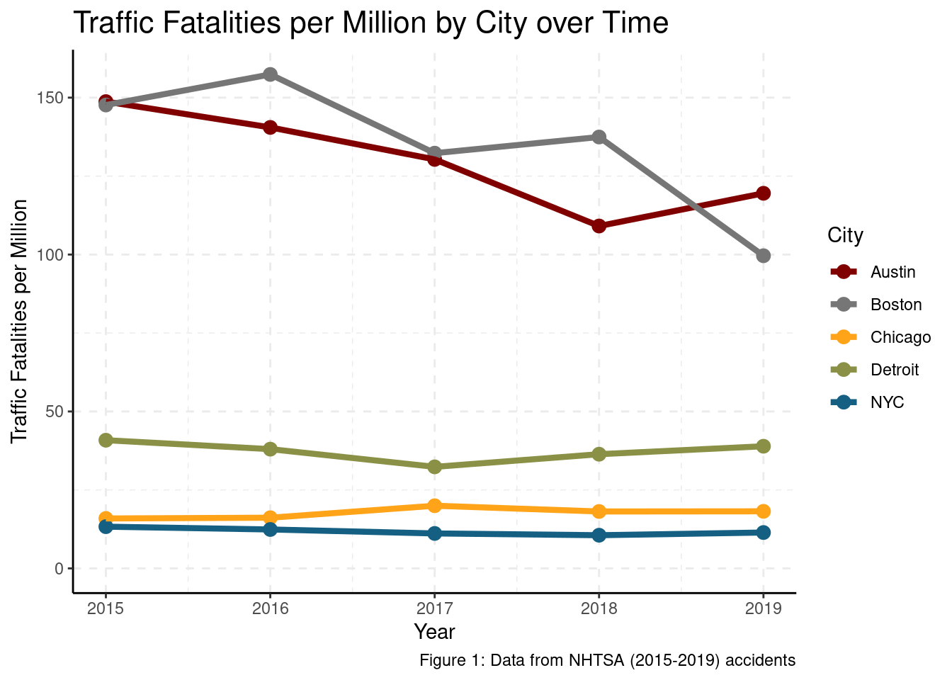
Looking at the data more closely, we find evidence that Austin and Boston’s higher traffic fatalities seem to be driven by increases in Non-Motor Vehicles and [at an] Angle accidents in comparison to those of other cities.
collisions <- accident %>%
  group_by(CITY, YEAR, MAN_COLL) %>%
  summarise(fatalities = n(), pop = first(pop), .groups = "drop") %>%
  filter(MAN_COLL != "Unknown") %>%
  mutate(fatalities = 1e6*fatalities/pop,
         MAN_COLL = relevel(factor(MAN_COLL), ref = "Head-On"),
         CITY = relevel(factor(CITY), ref = "Detroit")) %>%
  group_by(MAN_COLL) %>%
  arrange(desc(CITY)) %>%
  summarise(model = list(glm(fatalities ~ CITY + YEAR)),
            fatalities, YEAR, MAN_COLL, CITY, .groups = "drop") %>%
  mutate(tidied = map(model, tidy, conf.int = TRUE)) %>%
  unnest(tidied) %>%
  mutate(p.value = format.pval(round(p.value, 2)))

collisions %>%
  dplyr::select(YEAR, MAN_COLL, CITY, fatalities) %>%
  distinct() %>%
  ggplot() +
  aes(x = YEAR, y = fatalities, color = MAN_COLL) +
  geom_point() +
  geom_line() +
  facet_wrap(.~CITY) +
  expand_limits(y = 0) +
  labs(title = str_wrap(paste("Traffic Fatalities per Million by Collision",
                              "Type per City over Time"), 70),
       y = "Traffic Fatalities per Million",
       x = "Year",
       caption = "Fig 2: Data from NHTSA (2015-2019) accidents",
       color = "Collision Type") +
  theme_classic() +
  theme(plot.title = element_text(size=15)) +
  grids(linetype = "dashed") +
  scale_color_uchicago() +
  theme(axis.text.x = element_text(size = 6),
        legend.position = "bottom")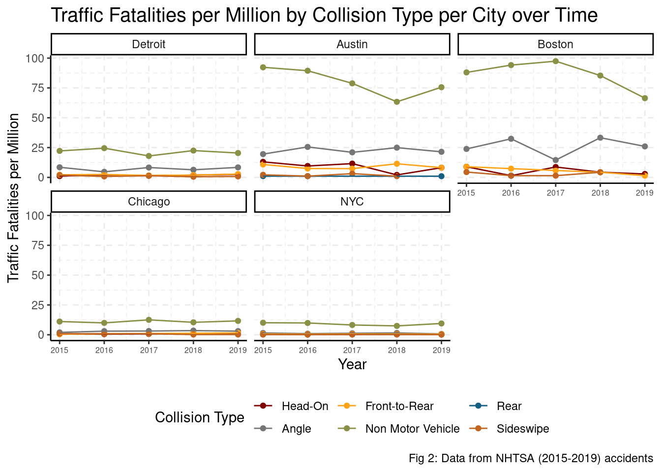
Figure 3 shows that the intuition from figure 2 is both statistically significant as well as significant from a public health perspective. Non-Motor Vehicle deaths account for an increase of 60 more traffic fatalities per million each year on average, above the already-high rate of at an head-on traffic fatalities in Detroit. More explicitly, on average, 44 more Bostonians and 55 more Austinites die from Non-Motor Vehicle accidents in comparison to those of a similar city such as Detroit according to this model.
collisions %>%
  filter(!term %in% c("(Intercept)", "YEAR")) %>%
  mutate(MAN_COLL = fct_reorder(MAN_COLL, estimate, .desc = FALSE),
         term = case_when(term == "CITYBoston" ~ "Boston",
                          term == "CITYChicago" ~ "Chicago",
                          term == "CITYDetroit" ~ "Detroit",
                          term == "CITYNYC" ~ "NYC",
                          term == "CITYSF" ~ "SF",
                          term == "CITYAustin" ~ "Austin")) %>%
  ggplot() +
  aes(x = estimate, y = MAN_COLL) +
  geom_point(size = 2) +
  geom_vline(xintercept = 0, lty = 2, color = "red") +
  geom_errorbarh(aes(xmin = conf.low, xmax = conf.high),
                 height = .1, size = 1) +
  facet_grid(.~term) +
  labs(title = str_wrap(paste("How do other Cities' Traffic Fatalities per million by Type",
                              "of Collisions compare to Detroit's",
                              "Head-On Collisions?"), 60),
       subtitle = TeX(paste("$\ accidents_t \\sim year_t + city_t$ where t is",
                            "the type of accident")),
       x = "Estimate",
       y = "Type of Collision",
       caption = "Fig 3: Data from NHTSA (2015-2019) accidents") +
  theme_classic() +
  theme(plot.title = element_text(size=16)) +
  grids(linetype = "dashed") +
  scale_color_uchicago()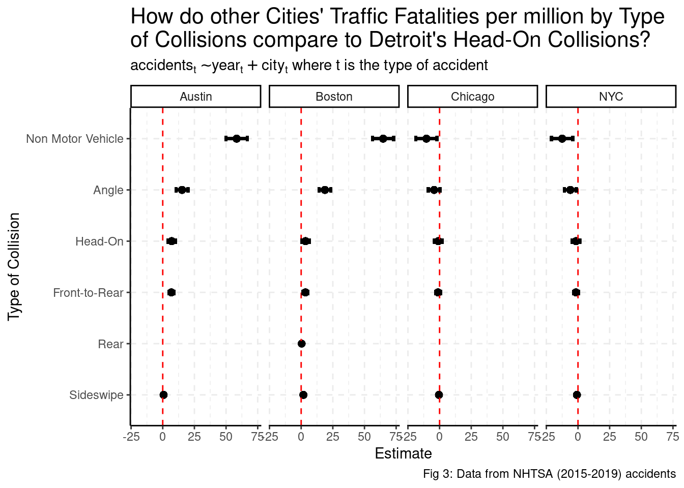
What external factors may be driving traffic fatalities?
Some auxiliary hypotheses driving the increased traffic fatalities per million between cities may include:
- Slower response time from accident to hospital
- Poorer visibility at night
- Higher cases of drunk driving
Lets start with the response time from accident to hospital.
Time to Hospital
Austin and Boston have similar response time distribution to other cities. In short, there is no evidence that slower response time is driving traffic fatalities.
accident %>%
  filter(response_time >= 0) %>%
  group_by(CITY) %>%
  summarise(mean_res = mean(response_time),
            response_time = response_time, .groups = "drop") %>%
  ggplot() +
  aes(x = response_time, y = fct_reorder(CITY, desc(mean_res)), fill = CITY) +
  geom_boxplot(outlier.shape = NA, show.legend = FALSE) +
  scale_x_continuous(breaks = c(1, 5, 10, 15, 30, 60, 90), limits = c(1, 30)) +
  labs(title = "Hospital reponse time and delivery of fatalities by City",
       subtitle = "Excluding outliers",
       y = "City",
       x = "Minutes",
       color = "",
       caption = "Fig 4: Data from NHTSA (2015-2019) accidents") +
  theme_classic() +
  theme(plot.title = element_text(size=16)) +
  grids(linetype = "dashed") +
  scale_fill_uchicago()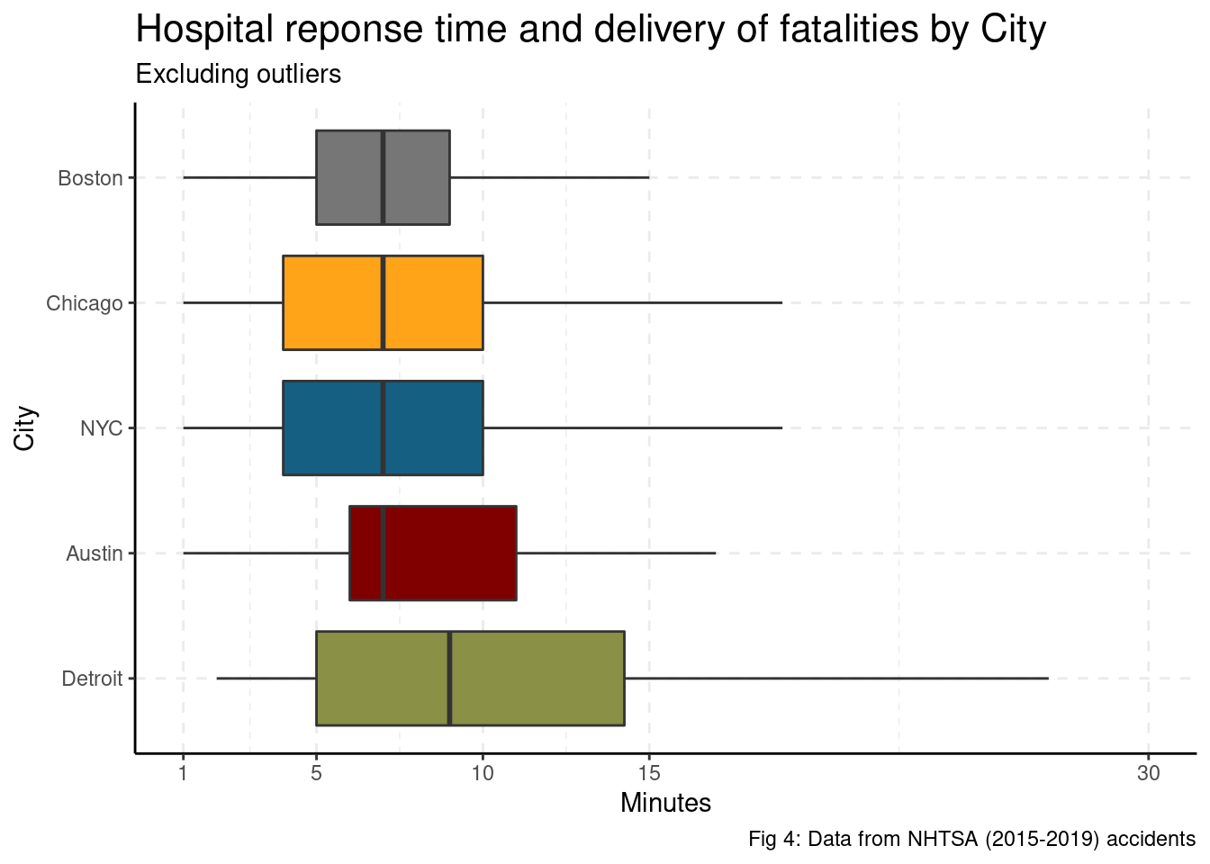
Disentangling poor visibility vs drunk driving
The next couple of auxiliary hypotheses are difficult to disentangle as many traffic fatalities caused by poor visibility and/or drunk driving happen at night. In fact, 37% of traffic fatalities that happen between 10:00pm - 4:59am included a drunk driver in the dataset, while only 12% of traffic fatalities during 5:00am to 9:59pm included a drunk driver.
accident %>%
  mutate(drunk = DRUNK_DR>0,
         night = (HOUR>=17 | HOUR <= 5)) %>%
  group_by(CITY, YEAR, drunk, night) %>%
  summarise(fatalities = n(), .groups = "drop") %>%
  left_join(population, by=c("CITY"="city", "YEAR"="year")) %>%
  mutate(fatalities = 1e6*fatalities/pop,
         drunk = ifelse(drunk, "Drunk", "Sober"),
         night = ifelse(night, "Night", "Day")) %>%
  na.omit() %>%
  ggplot() +
  aes(x = YEAR, y = fatalities, color = CITY) +
  geom_point() +
  geom_line() +
  labs(x = "Year",
       y = "Traffic Fatalities per Million",
       title = "Traffic Fatalities per Million per City Day/Night vs Sober/Drunk",
       subtitle = "Day/Night is 5am - 5pm",
       caption = "Fig 5: Data from NHTSA accidents",
       color = "City") +
  theme_classic() +
  theme(plot.title = element_text(size=13)) +
  grids(linetype = "dashed") +
  scale_color_uchicago() +
  facet_grid(drunk~night)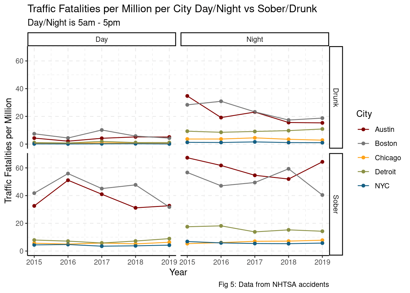
The plot above indicates that Austin and Boston’s increased fatalities per million appear to be driven more by sober and night-time fatalities than day-time or drunk fatalities. This is an imbalance problem as the rate of sober crashes is likely to be much higher than the rate of drunk crashes. Given this data limitation, we can look at the distribution of rates of day/night and drunk/sober traffic fatalities within each city.
accident %>%
mutate(drunk = DRUNK_DR>0,
night = (HOUR>=17 | HOUR <= 5)) %>%
na.omit() %>%
group_by(CITY, drunk, night) %>%
summarise(fatalities = n(), .groups = "drop") %>%
group_by(CITY) %>%
summarise(fatalities = fatalities/sum(fatalities),
drunk = drunk,
night = night,
.groups = "drop") %>%
mutate(drunk = ifelse(drunk, "Drunk", "Sober"),
night = ifelse(night, "Night", "Day")) %>%
complete(drunk, CITY, night, fill = list(fatalities = 0)) %>%
ggplot() +
aes(y = fatalities, x = interaction(night, drunk, sep = " & "), fill = CITY) +
geom_col(position = "dodge") +
labs(x = "",
y = "",
title = "Traffic Fatalities Histogram of Day/Night and Sober/Drunk per City",
subtitle = "5 Year Average; Day/Night is 5am - 5pm",
caption = "Fig 6: Data from NHTSA accidents",
fill = "City") +
theme_classic() +
theme(plot.title = element_text(size=13)) +
grids(linetype = "dashed") +
scale_fill_uchicago() +
scale_y_continuous(labels = scales::percent_format(1)) +
facet_grid(.~CITY) +
theme(axis.text.x = element_text(angle = 45, hjust = 1))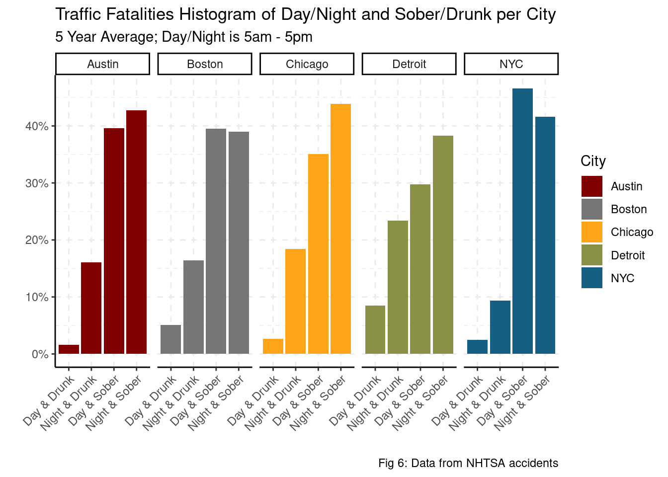 As shown in fig 6, Sober traffic fatalities account for 70% - 85% of all traffic fatalities in each city. It worth noting that NYC’s night-time and drunk traffic fatalities are less than 10% of their total traffic fatalities where in other cities, that proportion varies from 15% - 25%. There is not much differentiating Austin and Boston from the other cities other than their rates of sober traffic fatalities are equality distributed between day-time and night-time. Other cities have a 5% - 10% spread between day-time and night-time fatalities conditional on that the fatality had no drunk drivers.
To continue exploring the relationship between day/night and drunk/sober traffic fatalities in each city, we’ll first need to look at the hourly traffic fatalities per million by city. We can build this analysis by counting the number of traffic fatalities in each city by the hour throughout each year, divide by population per million to get a rate, and then average across the different years in each city.
hour_analysis <- function(df) {
  df %>%
    group_by(CITY, HOUR, YEAR) %>%
    summarise(fatalities = sum(FATALS),
              .groups = "drop") %>%
    complete(HOUR, YEAR, CITY, fill = list(fatalities = 0)) %>%
    left_join(population, by=c("CITY"="city", "YEAR"="year")) %>%
    mutate(fatalities = 1e6*fatalities/pop)
}

hourly_accidents <- hour_analysis(accident) %>%
  group_by(CITY, HOUR) %>%
  summarise(fatalities = mean(fatalities), .groups="drop")

max_fatals <- max(hourly_accidents$fatalities) +
  sd(hourly_accidents$fatalities)/3

hourly_accidents %>%
  ggplot() +
  aes(x = HOUR, y = fatalities, color = CITY) +
  geom_line() +
  theme_classic() +
  scale_color_uchicago() +
  scale_x_continuous(breaks = seq(0, 23.1, 3)) +
  labs(x = "Hour",
       y = "Traffic Fatalities per Million",
       title = paste("Yearly Traffic Fatalities per Million By City",
                     "per Hour"),
       subtitle = "With shaded Rush Hours and cyclical trend",
       caption = "Fig 7: Data from (2015-2019) accidents") +
  geom_smooth(se = FALSE, method = "glm", linetype = "dashed",
              formula = y ~ sin(2*pi*x/24) + cos(2*pi*x/24)) +
  annotate("rect", xmin = 6, xmax = 10, ymin = 0, ymax = max_fatals, alpha = .2) +
  annotate("rect", xmin = 16, xmax = 20, ymin = 0, ymax = max_fatals, alpha = .2) +
  grids(linetype = "dashed")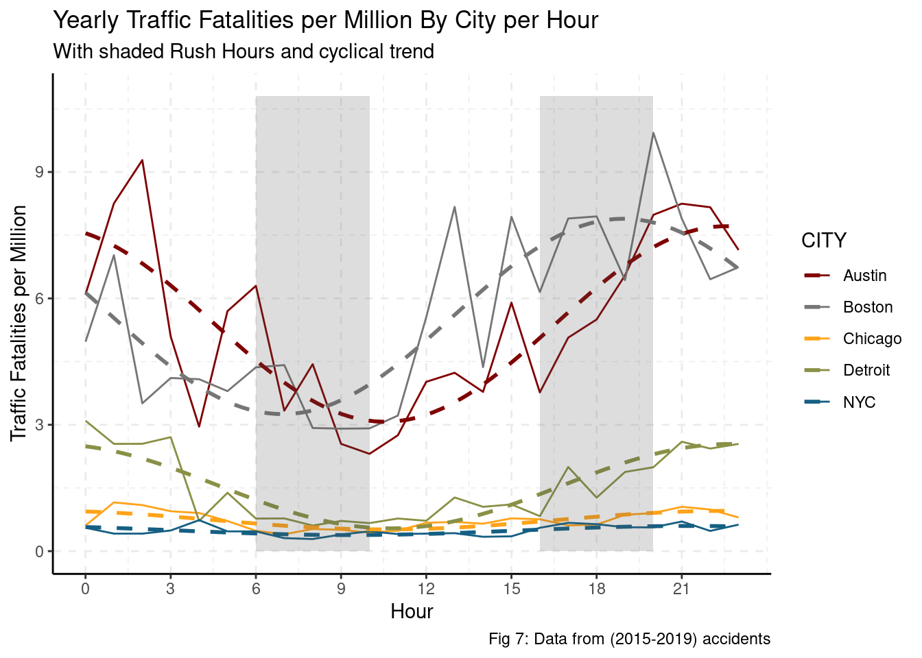
The data suggests a seasonal hourly trend with a peak in the evening/night for most cities. This would suggest that any sort of rush hour effect is superseded by a visibility or night life effect. Ignoring the seasonal hourly trend, Austin and Boston have an order of magnitude higher traffic fatalities per million. Additionally, Austin and Boston have a much higher difference in traffic fatalities per million between night and day than other cities. That is, night-time driving in Austin and Boston (as compared to day-time driving) corresponds to a much higher number of fatalities than for other cities. Even if Austin and Boston managed to reduce the incidence of their night traffic fatalities to the level of their day traffic fatalities, they would still be an order of magnitude above the peaks of Detroit, Chicago, or NYC. Austin and Boston have the worst incidences of night traffic fatalities, but this only accounts for 50% of the increased number of traffic fatalities when compared to other cities.
Since there are many more sober traffic fatalities per million in the data set, to adequately compare between sober and drunk driving fatalities, we can find the percent of hourly traffic fatalities per million per sober fatalities and per drunk driving fatalities. Afterwards, we will be able to directly compare the amplitudes between each city and within each city.
drunk <- accident %>%
  filter(DRUNK_DR > 0) %>%
  hour_analysis() %>%
  mutate(drunk = TRUE) %>%
  group_by(CITY, drunk, YEAR) %>%
  summarise(fatalities = fatalities/sum(fatalities),
            HOUR = HOUR,
            drunk = drunk,
            .groups = "drop")
sober <- accident %>%
  filter(DRUNK_DR == 0) %>%
  hour_analysis() %>%
  mutate(drunk = FALSE) %>%
  group_by(CITY, drunk, YEAR) %>%
  summarise(fatalities = fatalities/sum(fatalities),
            HOUR = HOUR,
            drunk = drunk,
            .groups = "drop")

proportion_drunk <- rbind(sober, drunk)

ave_sober <- sober %>%
  group_by(CITY, drunk, HOUR) %>%
  summarise(mean_fatal = mean(fatalities), .groups = "drop")

ave_drunk <- drunk %>%
  group_by(CITY, drunk, HOUR) %>%
  summarise(mean_fatal = mean(fatalities), .groups = "drop")

rbind(ave_drunk, ave_sober) %>%
  mutate(drunk = ifelse(drunk, "Drunk Driving", "Sober")) %>%
  ggplot() +
  aes(x = HOUR, y = mean_fatal, color = drunk) +
  geom_line() +
  theme_classic() +
  scale_color_lancet() +
  scale_x_continuous(breaks = seq(0, 25, 3),
                     labels = seq(0, 25, 3) %% 24) +
  scale_y_continuous(labels = scales::percent_format()) +
  labs(x = "Hour",
       y = "Conditional Percentage of Traffic Fatalities",
       title = str_wrap(
         paste("Hourly Conditional Percentage of Traffic Fatalities per",
               "Million By City for Drunk Drivers vs. Sober Drivers"), 75),
       subtitle = "Averaged across 5 years",
       caption = "Fig 8: Data from NHTSA (2015-2019) accidents",
       color = "") +
  facet_wrap(.~CITY) +
  grids(linetype = "dashed") +
  theme(legend.position = "bottom")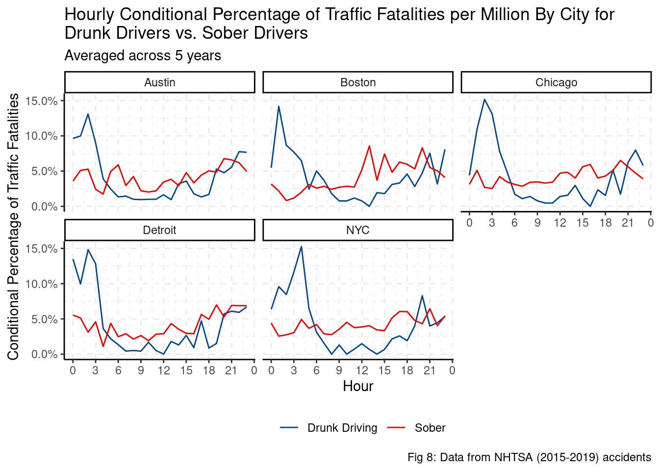
Controlling for the size of drunk and sober traffic fatalities, most drunk driving traffic fatalities per million occur just after midnight with a trough during the day. Unlike drunk traffic fatalities, sober traffic fatalities have a very minor, if any, hourly seasonal trend. In other words, there does not appear to be an increase in traffic fatalities during the night in most cities. With the following regression we can estimate statistical differences in seasonality of hourly traffic fatalities, as well as when they peak.
\[ Fatalities_{city, drunk} \sim A_{city, drunk} \cos(Hour_{city,drunk} - D_{city, drunk})\] Through a bootstrapped model, we can find estimates of \(A_{city,drunk}\) and \(D_{city,drunk}\) and comparethe rates of fatalities within cities (sober vs drunk) and between cities (Chicago vs Austin).
fit_nls_on_bootstrap_drunk <- function(split) {
  nls(formula = fatalities ~
        (!drunk)*(
          (CITY=="Austin")*A11*cos(2*pi*HOUR/24 - D11) +
            (CITY=="Boston")*A21*cos(2*pi*HOUR/24 - D21) +
            (CITY=="Chicago")*A31*cos(2*pi*HOUR/24 - D31) +
            (CITY=="Detroit")*A41*cos(2*pi*HOUR/24 - D41) +
            (CITY=="NYC")*A51*cos(2*pi*HOUR/24 - D51)) +
        (drunk)*(
          (CITY=="Austin")*A12*cos(2*pi*HOUR/24 - D12) +
            (CITY=="Boston")*A22*cos(2*pi*HOUR/24 - D22) +
            (CITY=="Chicago")*A32*cos(2*pi*HOUR/24 - D32) +
            (CITY=="Detroit")*A42*cos(2*pi*HOUR/24 - D42) +
            (CITY=="NYC")*A52*cos(2*pi*HOUR/24 - D52)),
      analysis(split),
      start = list(A11 = 1, A21 = 1, A31 = 1, A41 = 1, A51 = 1,
                   A12 = 1, A22 = 1, A32 = 1, A42 = 1, A52 = 1,
                   D11 = pi, D21 = pi, D31 = pi, D41 = pi, D51 = pi,
                   D12 = pi, D22 = pi, D32 = pi, D42 = pi, D52 = pi))
}

bootstrap_model_drunk <- function(df) {
  boot_models <- df %>%
    bootstraps(times = 2000, apparent = TRUE) %>%
    mutate(model = map(splits, fit_nls_on_bootstrap_drunk),
           coef_info = map(model, tidy))

  boot_models %>%
    unnest(coef_info) %>%
    left_join(int_pctl(boot_models, coef_info), by="term") %>%
    mutate(term = case_when(term == "A11" ~ "A_Austin",
                            term == "A21" ~ "A_Boston",
                            term == "A31" ~ "A_Chicago",
                            term == "A41" ~ "A_Detroit",
                            term == "A51" ~ "A_NYC",
                            term == "D11" ~ "D_Austin",
                            term == "D21" ~ "D_Boston",
                            term == "D31" ~ "D_Chicago",
                            term == "D41" ~ "D_Detroit",
                            term == "D51" ~ "D_NYC",
                            term == "A12" ~ "A_Austin_drunk",
                            term == "A22" ~ "A_Boston_drunk",
                            term == "A32" ~ "A_Chicago_drunk",
                            term == "A42" ~ "A_Detroit_drunk",
                            term == "A52" ~ "A_NYC_drunk",
                            term == "D12" ~ "D_Austin_drunk",
                            term == "D22" ~ "D_Boston_drunk",
                            term == "D32" ~ "D_Chicago_drunk",
                            term == "D42" ~ "D_Detroit_drunk",
                            term == "D52" ~ "D_NYC_drunk"))
}

boot_coef_drunk <- proportion_drunk %>%
  bootstrap_model_drunk()

adj_drunk <- boot_coef_drunk %>%
  mutate(city = str_extract(term, "(?<=_)[^_]+")) %>%
  filter(str_detect(term, "A_")) %>%
  mutate(drunk = str_detect(term, "drunk")) %>%
  group_by(id, city, drunk) %>%
  summarise(positive = estimate > 0, .groups = "drop")

boot_coef_adj_drunk <- boot_coef_drunk %>%
  mutate(drunk = str_detect(term, "drunk"),
         city = str_extract(term, "(?<=_)[^_]+")) %>%
  left_join(adj_drunk, by = c("city", "id", "drunk")) %>%
  mutate(estimate = case_when(
    str_detect(term, "A_") & !positive ~ -estimate,
    str_detect(term, "D_") & !positive ~ estimate + pi,
    TRUE ~ estimate))

drunk_A <- boot_coef_adj_drunk %>%
  filter(str_detect(term, "A_")) %>%
  mutate(term = str_remove(term, "_drunk")) %>%
  group_by(term, drunk) %>%
  summarise(mean_est = median(estimate),
            q05 = quantile(estimate, 0.05),
            q95 = quantile(estimate, 0.95),
            id = id,
            estimate = estimate, .groups = "drop") %>%
  mutate(term = str_remove(term, "A_"),
         drunk = ifelse(drunk, "Drunk", "Sober"))
Amplitude of Hourly Traffic Fatalities
Assuming a simple seasonal model, the data suggests that in most cities, there is a clear difference between drunk and sober traffic fatalities. Specifically, drunk traffic fatalities have higher amplitude (larger difference in traffic fatalities between the peaks and trough). Only in Boston is it somewhat difficult to distinguish between the drunk and sober amplitude of traffic fatalities.
drunk_A %>%
  ggplot() +
  aes(x = estimate, fill = drunk, alpha = 0.3) +
  geom_histogram(bins = 100) +
  geom_vline(aes(xintercept = mean_est, color = drunk)) +
  geom_vline(aes(xintercept = q05, color = drunk), linetype = "dashed") +
  geom_vline(aes(xintercept = q95, color = drunk), linetype = "dashed") +
  facet_grid(term ~ .) +
  theme_classic() +
  labs(title = str_wrap(
    paste("Estimated Amplitude of Conditional Percentage Traffic",
          "Fatality per million By City for Drunk Drivers vs. Sober",
          "Drivers"), 70),
    subtitle = TeX(paste("$ Fatalities_{city,drunk} \\sim A_{city,drunk}",
                         "\\cos(Hour_{city,drunk} - D_{city,drunk}) $")),
    x = "Estimated Amplitude",
    y = TeX("Count of bootstrapped $ \\hat{A}_{city,drunk} $"),
    fill = "",
    caption = "Fig 9: Data from NHTSA (2015 - 2019) accidents") +
  scale_fill_lancet() +
  scale_color_lancet() +
  grids(linetype = "dashed") +
  theme(legend.position = "bottom") +
  guides(color = FALSE, alpha = FALSE)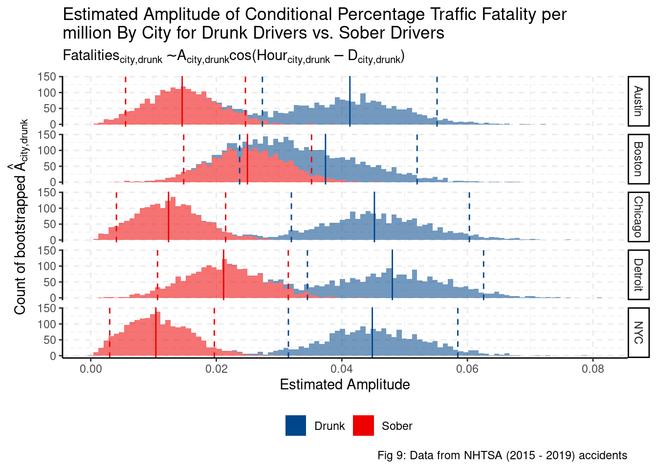
Peak of Hourly Traffic Fatalities
Using directional statistics, we can estimate the time at which peak traffic fatalities occur in each city. We use directional statistics as the domain, hours, is wrapped (hour 0 is next to hour 23 and hour 1). We can see that every city has the same peak for drunk driving fatalities, 1am. However, for sober traffic fatalities, the peak time is shifted to 5pm, 7pm, and 9pm. These results are all meaningful and statistically significant. We can imagine that most drunk driving fatalities happen at night as most drinking happens at night. Given that most cities’ rush hours end before 7pm, the higher fatalities appear to be driven more by poor visibility on the road. We would need to get average number of active cars per hour to better determine if the rate of fatalities is being driven by a higher number of cars on the road or poorer visibility.
drunk_D <- boot_coef_adj_drunk %>%
  filter(str_detect(term, "D_")) %>%
  mutate(estimate = estimate %% (2*pi) - pi,
         term = str_remove(term, "_drunk"),
         term = str_remove(term, "D_"),
         drunk = ifelse(drunk, "Drunk", "Sober")) %>%
  dplyr::select(term, drunk, estimate, id) %>%
  group_by(term, drunk) %>%
  summarise(mean = 12/pi*circ.mean(estimate) + 12,
            sd = 12/pi*sqrt(1/est.kappa(estimate)),
            estimate = (12*(estimate)/pi) + 12,
            id = id,
            .groups = "drop") %>%
  mutate(estimate = (estimate - 8) %% 24,
         mean = (mean - 8) %% 24)

drunk_D %>%
  ggplot() +
  aes(x = estimate, fill = drunk, alpha = 0.3) +
  geom_histogram(bins = 50) +
  scale_x_continuous(breaks = seq(0, 24, 2),
                     labels = seq(8, 24 + 8, 2) %% 24) +
  geom_vline(aes(xintercept = (mean %% 24), color = drunk)) +
  geom_vline(aes(xintercept = (mean + 1.96*sd), color = drunk), linetype = "dashed") +
  geom_vline(aes(xintercept = (mean - 1.96*sd), color = drunk), linetype = "dashed") +
  facet_grid(term ~ .) +
  theme_classic() +
  scale_fill_lancet() +
  scale_color_lancet() +
  labs(title = "Estimate of Peak Hourly Traffic Fatalities",
       x = "Hour",
       y = TeX("Counts of bootstrapped $ \\hat{D}_{city,drunk} + \\pi$"),
       subtitle = TeX(paste("$ Fatalities_{city,drunk} \\sim A_{city,drunk}",
                            "\\cos(Hour_{city,drunk} - D_{city,drunk}) $")),
       fill = "City",
       caption = "Fig 10: Data from NHTSA accidents") +
  grids(linetype = "dashed") +
  guides(color = FALSE, alpha = FALSE) +
  theme(legend.position = "bottom")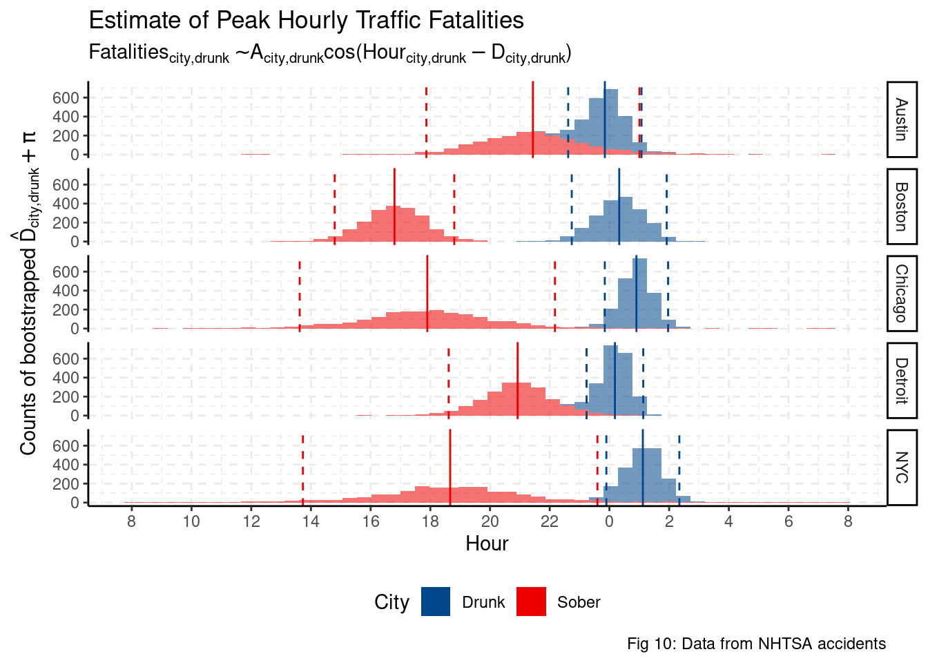
This analysis is not able to conclusively disentangle the effects of drunk driving and poor visibility. Only Boston has a noticeable difference in amplitude between drunk driving fatalities and sober fatalities. Similarly, peak hours for sober vs drunk traffic fatalities do not differentiate cities with high traffic fatalities per million vs cities with low traffic fatalities per million.
drunk_A %>%
  left_join(drunk_D, by=c("id", "term", "drunk"),
            suffix = c(".A", ".D")) %>%
  ggplot() +
  aes(y = estimate.A, x = estimate.D, color = drunk) +
  geom_point(alpha=0.3) +
  labs(title = "Scatter plot between estimates of A and D per City",
       x = "Estimate of D",
       y = "Estimate of A") +
  facet_grid(.~term) +
  scale_color_lancet() +
  theme_classic()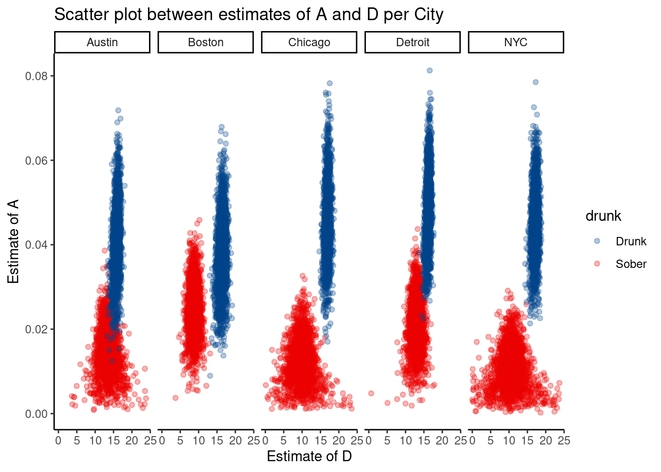
We can also see some issues with the estimate as the variance of the estimate for D is related to the estimate of A. More concretely, it is difficult to find the estimate for the min/max of a flat line. As A tends towards 0, the cyclical function A cos(X - D) becomes more linear.
Unfortunately, this weeks analysis leaves more questions than answers. Hopefully, I can find a data set of accidents and miles driving in each city to have a more complete analysis.